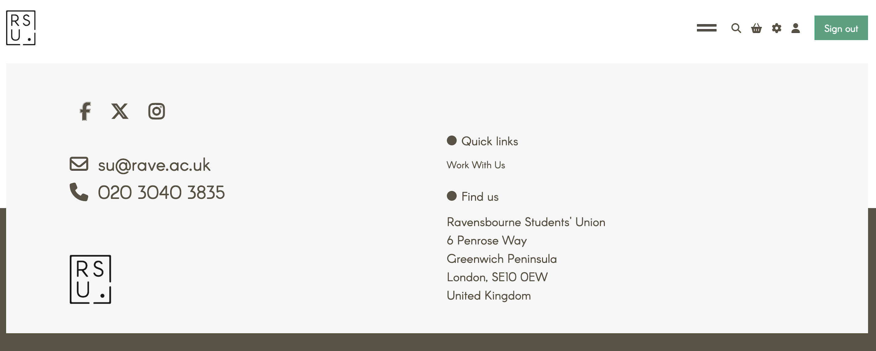
Ravensbourne Students' Union
A non-functional union website, rebuilt end-to-end into a student-facing hub — audited, redesigned, developed, and tested solo.
- Role
- Solo Designer & Developer
- For
- Ravensbourne Students' Union
- When
- 2025
Built with — HTML · CSS · JavaScript · Bootstrap · Font Awesome · MSL CMS
Overview
The Ravensbourne Students' Union (RSU) website was the union's primary channel for student information — clubs, events, elections, and more. But it wasn't functioning as one.
Students were reporting difficulties using the site to find what they needed. Staff spent significant time fielding the same questions every week: “what clubs do we have”, “when are the events”, “who is my course rep”. The university had also grown concerned that the dysfunction was undermining the union's credibility.
I was brought in to audit, research, redesign, develop, and test it — end-to-end. Delivered inside a client CMS (MSL), with custom JavaScript for search, filtering, and interactive components.
Solo
Designer + developer
7
Sections rebuilt
Sept 2025
Shipped for intake
The problem
Before designing anything, I audited the live site against three lenses: navigation, content, and accessibility.
Navigation structure
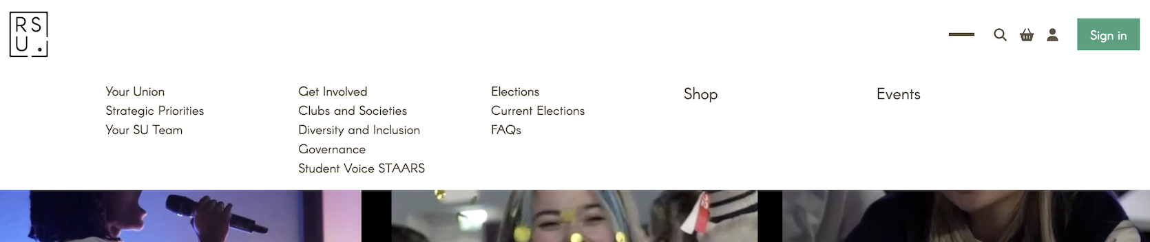
The navigation presented all items at the same visual level — top-level sections such as Your Union and Get Involved appeared identical in weight and style to their own child pages, such as Clubs and Societies and Your SU Team. There was no visual hierarchy to indicate parent–child relationships, leaving users with no clear sense of where they were or how the site was structured.
The naming compounded the problem. Labels like Your Union and Your SU Team implied similar content; Strategic Priorities and Governance gave students no real indication of what they'd find there. Fundamentally, the navigation had been built around the union's internal structure — not around how students actually think, or what they actually need.
Content
The content audit revealed the navigation problem wasn't just visual — it ran deeper into the site's structure.
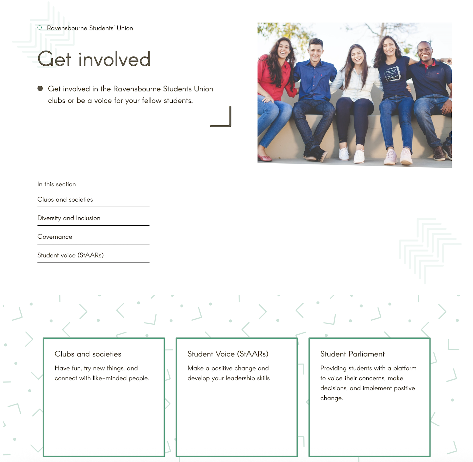
Pages like Get Involved and Your Union contained almost no content of their own — just repeated links to their child pages, adding an unnecessary layer of navigation without adding any value. The exception was Elections, which mixed link-listing with some genuinely useful resources, suggesting the pattern was inconsistent rather than intentional.
Several key sections were empty or broken. The Events page existed in the navigation but was completely blank. Governance contained duplicated paragraphs. Clubs and Societies redirected to an external platform with outdated information.
Accessibility
- Interactive-looking elements that weren't actually clickable, creating false affordances
- Broken images across multiple pages
- Poor colour contrast, affecting users with visual impairments or colour blindness
- No consistent heading hierarchy, undermining readability and screen-reader navigation
- Form fields without proper labels
The homepage also featured a looping three-column GIF — decorative, but enough to cause a noticeably slower page load.
Process & Key Decisions
Five moves turned a broken site into a self-serve hub — grounded in research, then worked through information architecture, content, the pages that didn't exist, the homepage, and a new visual system.
Research & discovery
Beyond the audit, I ran one-to-one interviews with the RSU president, vice president, and staff — supplemented by informal conversations with students — to understand:
The questions students asked most frequently
Resources and information the RSU provides that students may not be aware of
The kind of online presence the RSU wanted — tone, feel, and purpose
Key findings
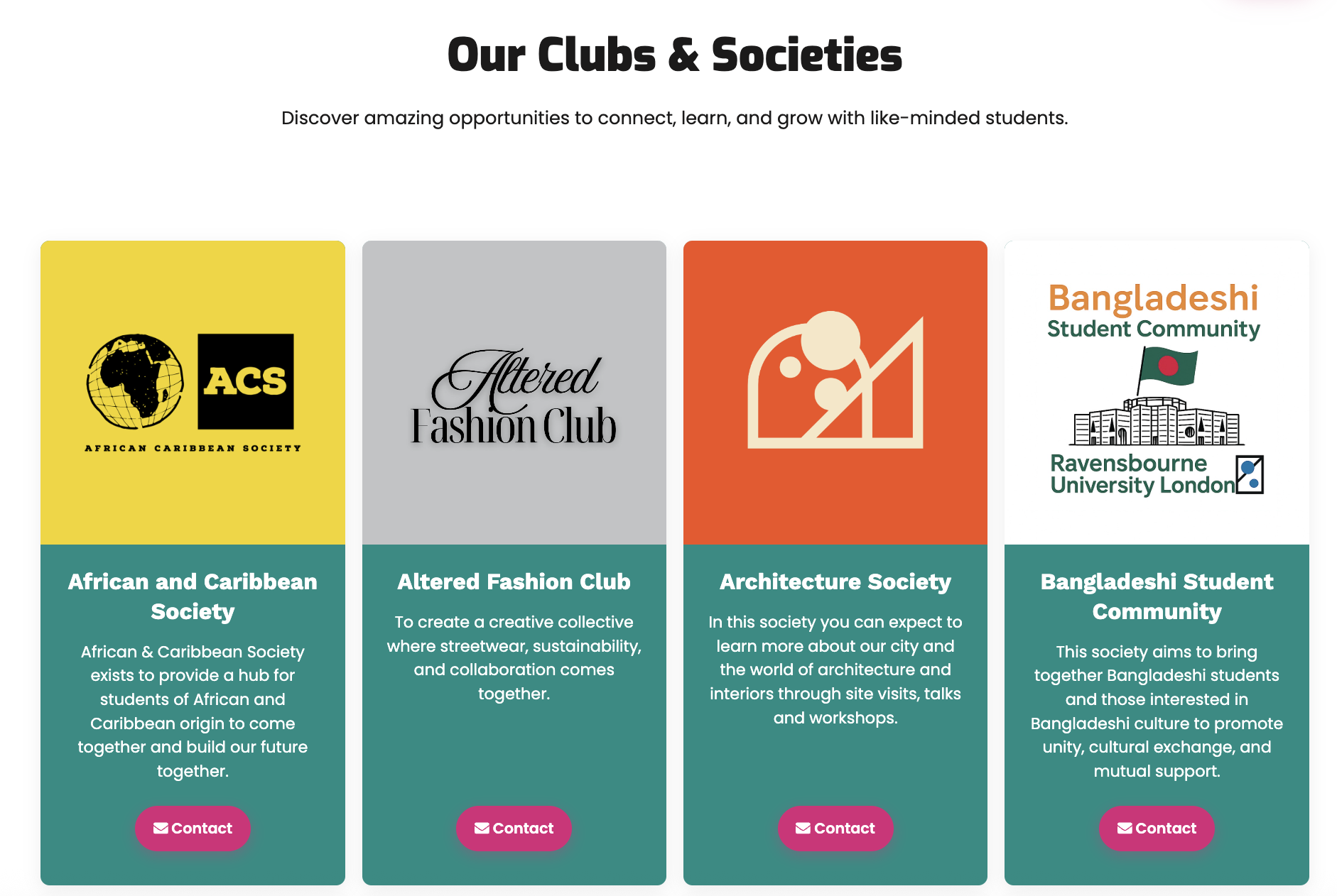
- Club discovery — what clubs exist, how to join, how to start one
- Course reps — who represents them and how to get in touch
- Events — what's coming up and how to get involved
- Student voice — how to make their views heard
- Hidden resources — club funding, jobs within the SU, student handbooks
Information architecture
The existing navigation reflected how the RSU organised itself internally — not how students think or what they come looking for. The restructure was guided by a single principle: every label should map directly to a student need.
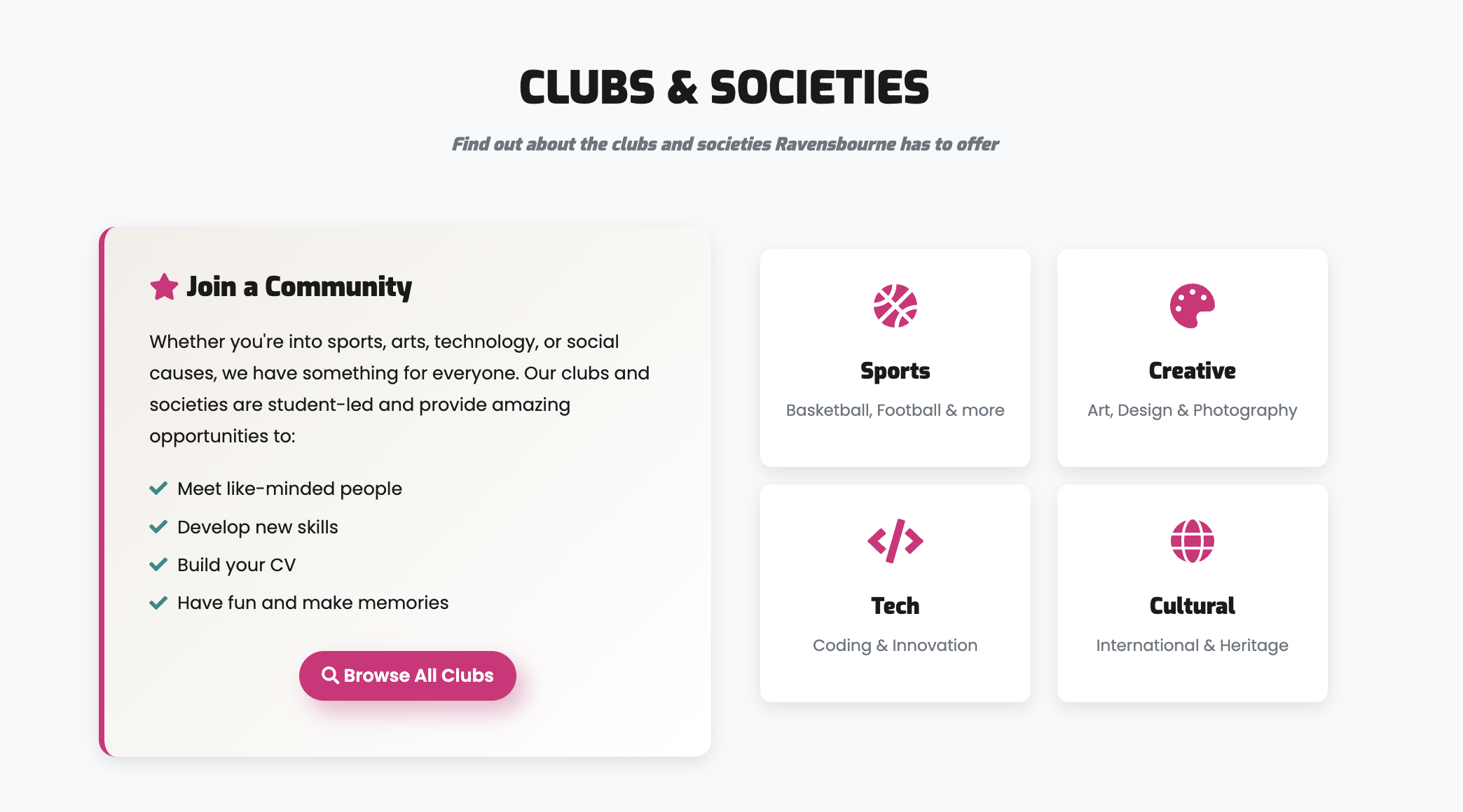
Navigation-only index pages were removed. Labels were rewritten in plain, student-facing language. Sections like Diversity and Inclusion, Governance, and Strategic Priorities were consolidated into more meaningful categories. Clubs & Societies was elevated to the top level given how often students asked about it. Course Reps — one of the most-asked-about topics — became a dedicated page. Shop was removed following an organisational change.
Before — built around the org
Your Union
- ↳ Strategic Priorities
- ↳ Your SU Team
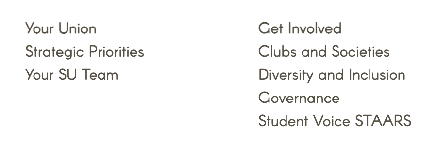
Get Involved
- ↳ Clubs and Societies
- ↳ Diversity and Inclusion
- ↳ Governance
- ↳ Student Voice STAARs
Elections
- ↳ Current Elections
- ↳ FAQs
Shop
Events
After — built around student need
Each label is distinct, student-facing, and maps to a clear area of need.
Self-serve content
A recurring pattern emerged across the audit and research: students were emailing staff for information that already existed — buried in lengthy internal documents, or simply never surfaced on the site. The solution, applied consistently across several sections, was to distill that complexity into structured, searchable FAQs built around the questions students and staff actually asked.
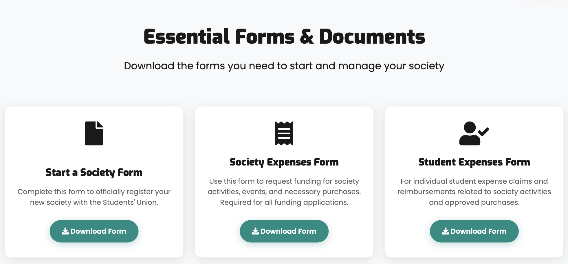
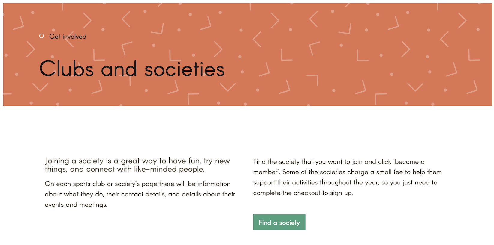
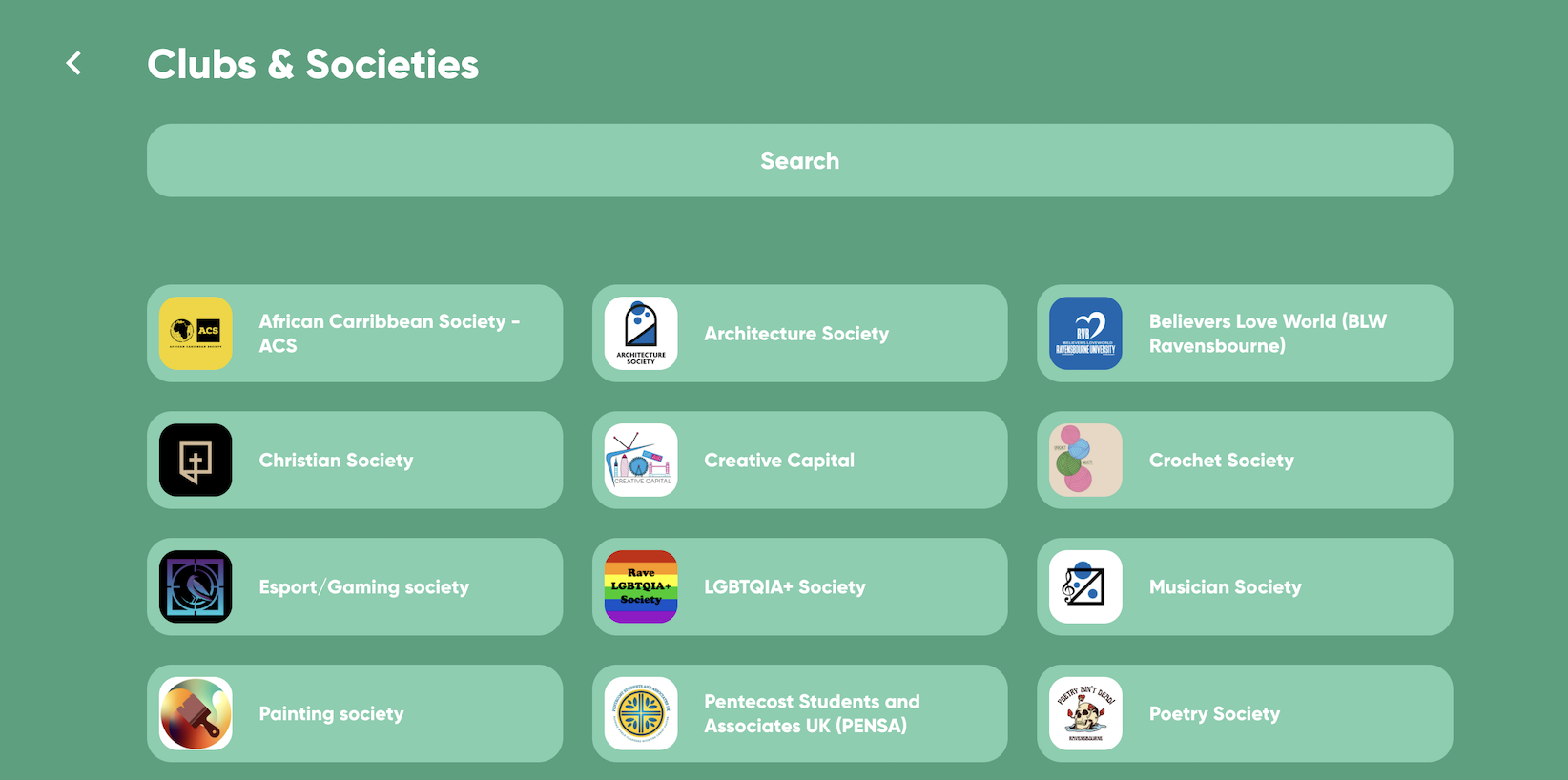
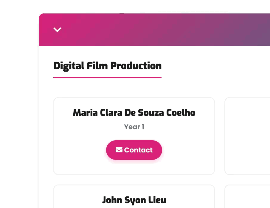
For Clubs & Societies, this meant working through a 20+ page societies handbook and restructuring it into an FAQ organised by the questions staff received most often — how to join, how to start a society, how to claim reimbursement. The page flow follows frequency of need: find a society → start a society → downloadable resources → FAQs. What previously required a multi-day email chain is now self-serve.
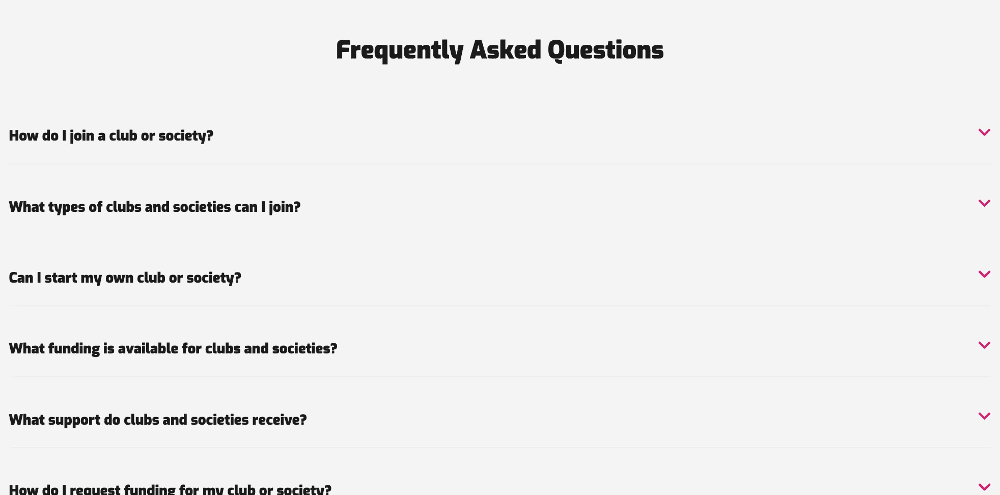
The same principle was applied to Student Voice and Elections. Content had been scattered across Governance, Student Voice STAARs, and Current Elections with no clear relationship between them. Each was consolidated into a single, coherent page — FAQs extracted from the handbooks, key information and downloadable resources brought together in one place.
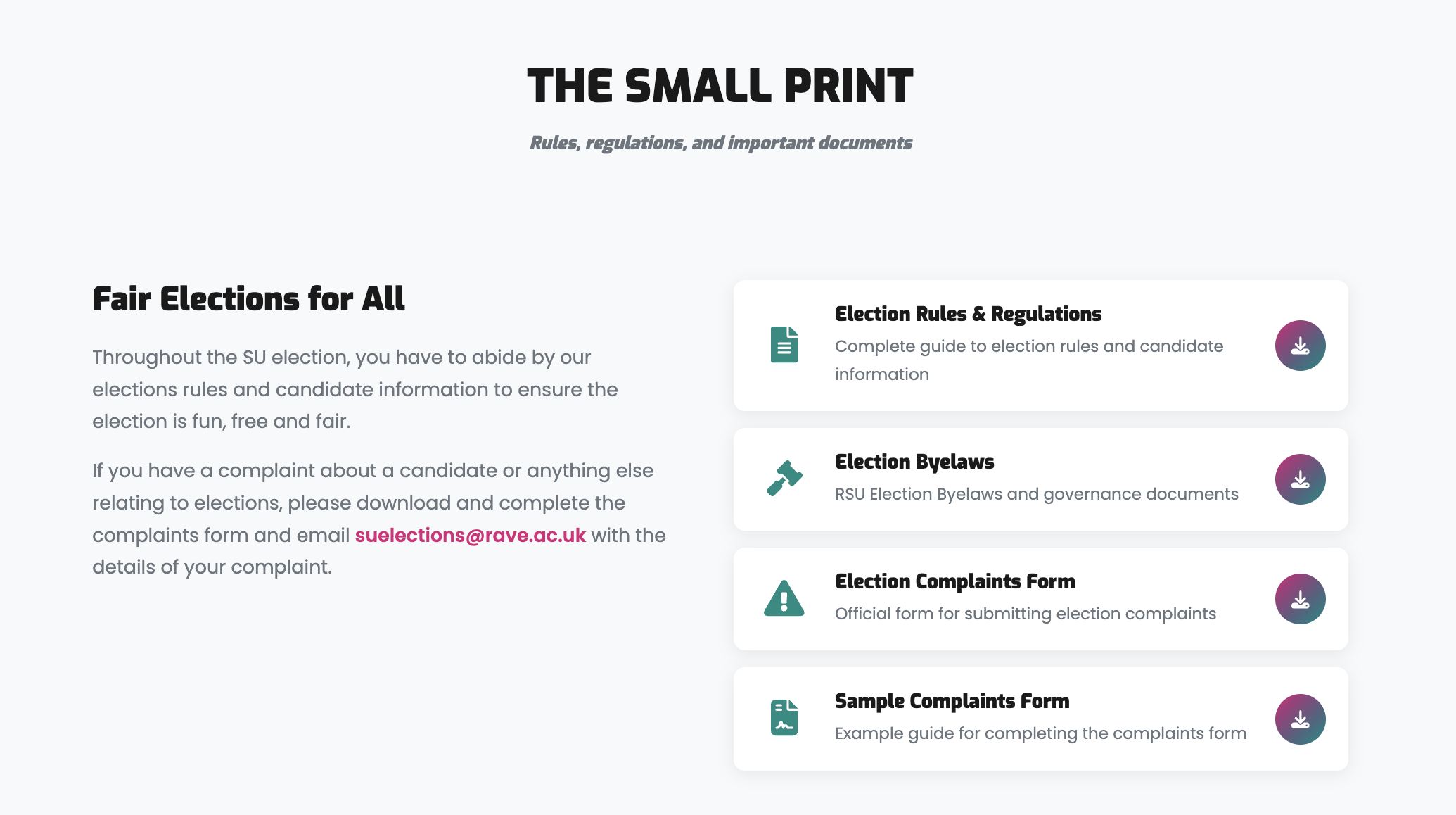
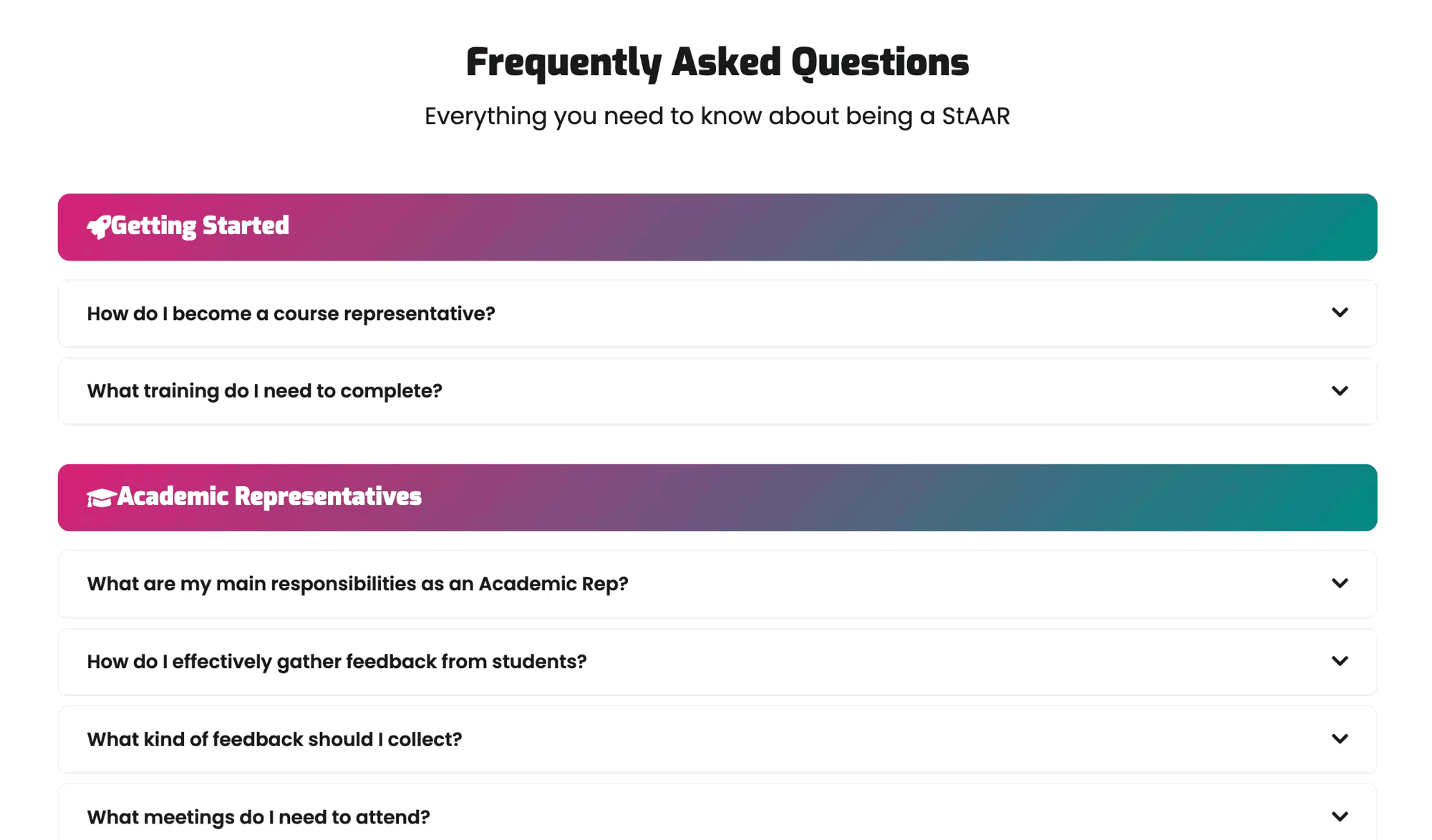
Students can now find everything they need — getting involved, understanding how elections work, or accessing the right documents — without piecing it together from across the site.
Building what wasn't there
Two of the most-asked-about areas had no functional pages at all.
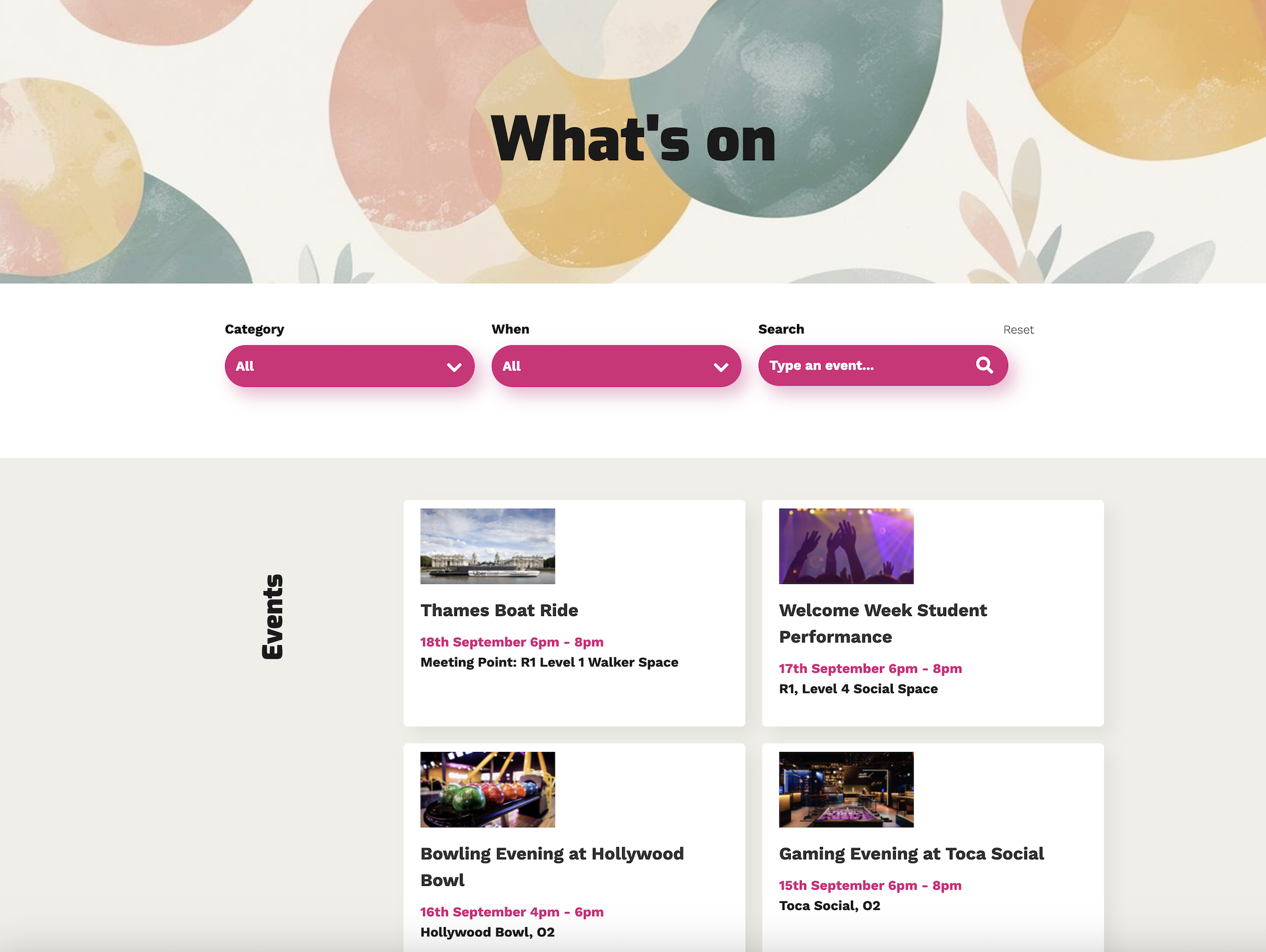
Events existed in the navigation but the page was completely blank. I designed and built a full event listing with category filtering, date filtering, and keyword search — so students can find what's coming up, filter by interest, and browse past events. Each event has its own detail page, with registration links where applicable.
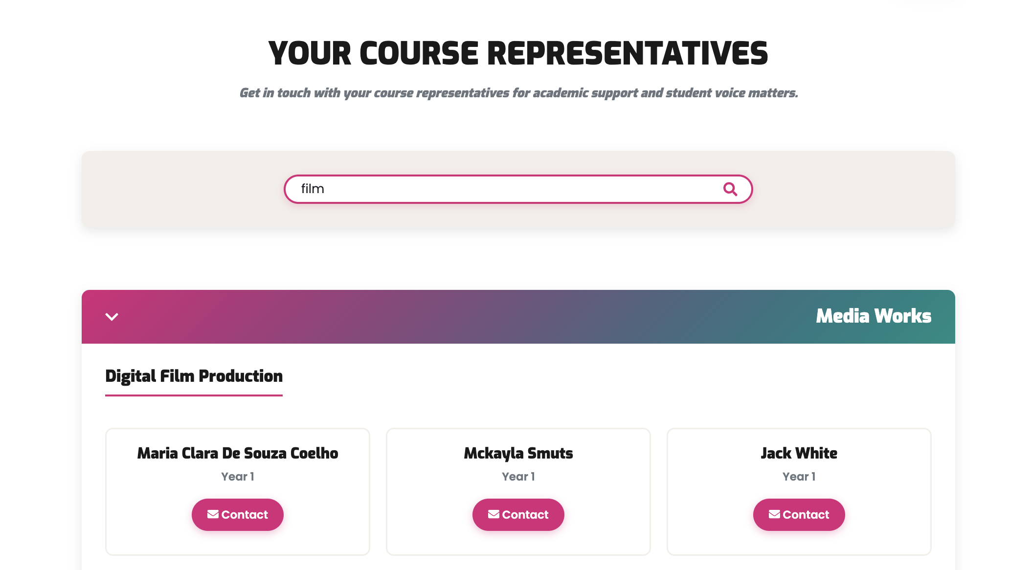
Course Reps didn't exist on the site at all. Finding a rep previously meant emailing staff, who would manually search a spreadsheet for each enquiry. A static list would have been equally unusable given the volume and variety of courses. I built a searchable directory organised by department and course, with real-time filtering by department, course name, or rep name.
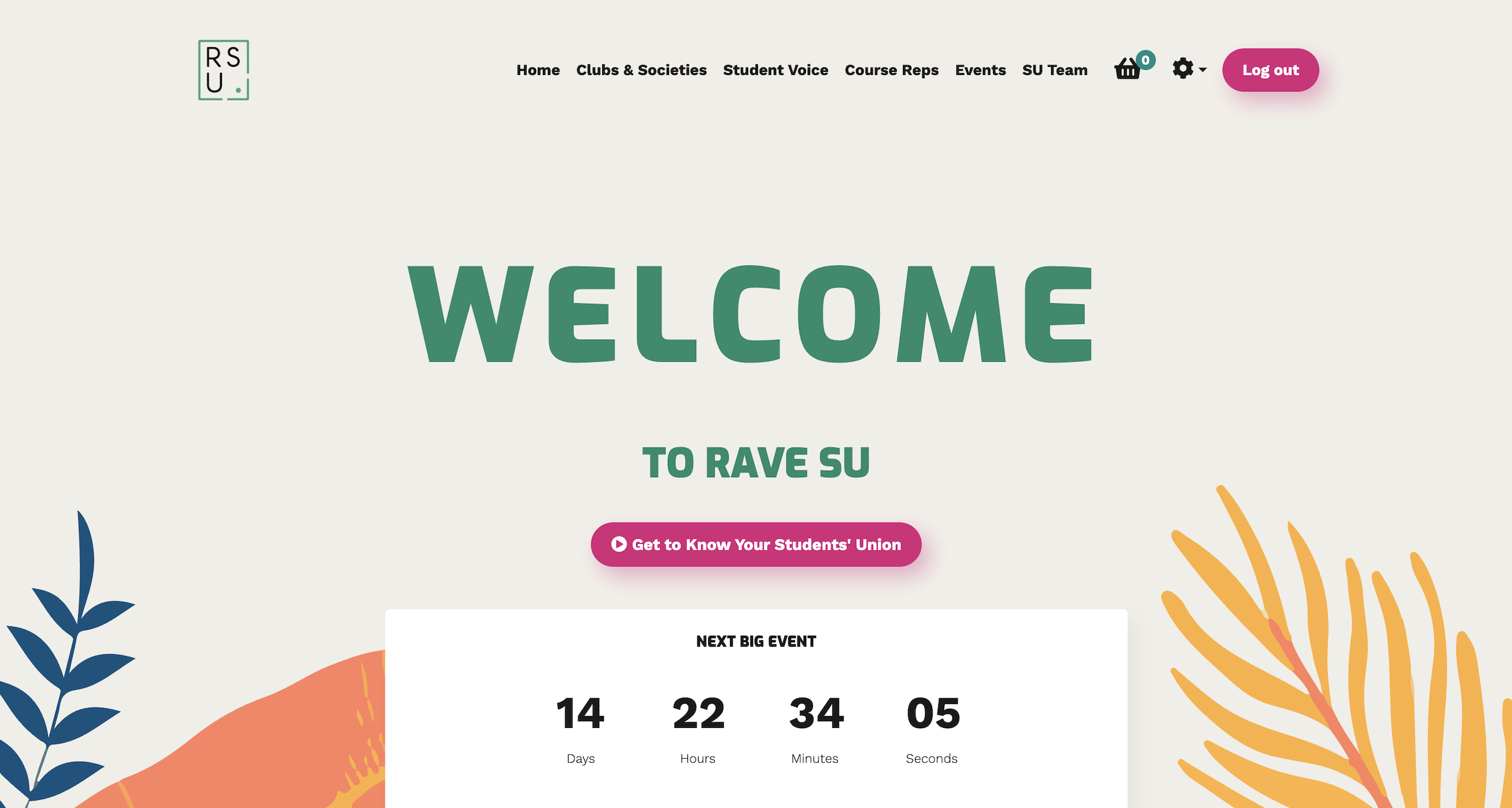
Homepage
The old homepage opened with a looping three-column GIF, followed by an empty news feed and a blank events section — the worst possible first impression for a student visiting for the first time.
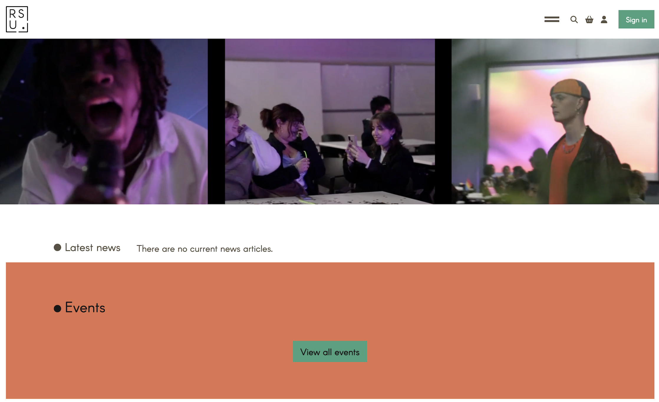
The redesign is built around the academic calendar. During welcome season the hero features a countdown clock, giving new students an immediate sense of arrival — followed by a short video introducing the union, then overviews of each main section with direct links.
A news and blog section was deliberately left out. Without a dedicated resource to maintain it consistently, it would have become another source of outdated content — the same problem the redesign set out to fix.
The homepage now does what it should: orient students quickly and point them where they need to go.
Visual system
The existing site's visual language was a significant part of the problem. Typography was dated and poorly suited to digital display; several colour combinations failed contrast checks. The redesign established a cohesive visual system.
Colour
#D92179
Primary Pink
Interactive / CTA / emphasis
#008C83
Primary Teal
Secondary / success / depth
#FEC810
Accent Yellow
Highlight / welfare
#1B1A1A
Near Black
Body text / UI structure
#F2EEE8
Warm White
Backgrounds / breathing room
The teal keeps a connection to the union's existing green, while the palette as a whole moves the brand somewhere more contemporary and student-facing. A pink-to-teal gradient runs consistently across hero sections, headers, and CTAs — a recognisable visual thread without relying on complex decoration. All combinations were checked against contrast requirements.
Typography
Aa
Exo
Page headings, card titles, team names, stat figures
Aa
Poppins
Body copy, descriptions, buttons, FAQ content
Exo — geometric and direct — suits an art-and-technology institution; Poppins keeps body copy clean, rounded, and approachable. A clear five-level hierarchy (H1 through caption) was defined and applied consistently across every page.
Motifs
- Cards lift on hover with shadow rather than a colour change
- A gradient bar animates across card tops on interaction
- All buttons share a consistent pill shape
- Warm white backgrounds soften the high-contrast palette throughout
Results
The redesigned site launched in September 2025 ahead of the new student intake, serving as a central part of the welcome experience from day one. It was introduced to students and staff across the university alongside broader marketing.
It was well received on launch — the university executive team and RSU staff noted it as a significant improvement, with the union finally having a fully functional, student-facing online presence.
Engagement
The site had been largely inaccessible for months before relaunch, and the pre/post window spans the summer — historically the quietest period for student services. With that context, the September-to-January growth is meaningful, and sustained month-on-month rather than a launch spike.
+675%
New registrations
+272%
Total logins
+570%
Unique logged-in users
+575%
Account activity
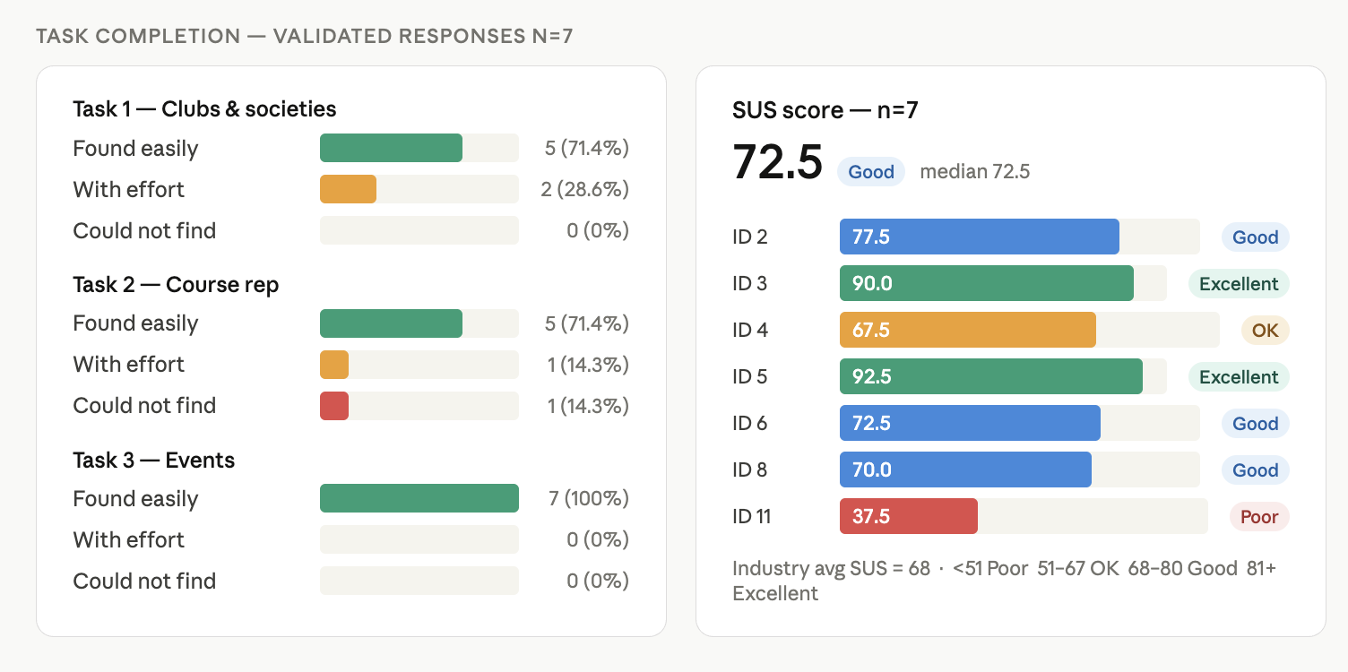
Usability testing
A post-launch survey ran with 24 participants across year groups. A filter question validated responses — only those who had genuinely used the site were retained, leaving 7 validated responses for task completion and SUS scoring.
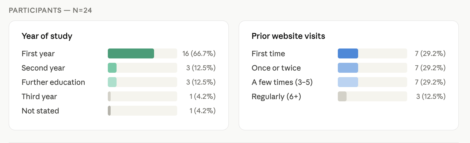
All three core tasks — finding clubs and societies, locating a course rep, and finding an event — saw strong completion. Events was found easily by 100% of participants; 71.4% found clubs and course-rep information easily.
Accessibility
The original site scored 52.76% against WCAG 2.0, 2.1 and 2.2. The redesign addressed the most critical failures: heading hierarchy rebuilt from scratch, colour contrast brought to AA throughout, form fields properly labelled, external links flagged for screen readers, and all icon buttons paired with visible text labels. A full re-audit is planned for the next phase.
Feedback
Very streamlined, and easy to access everything I needed to find.
Clean and modern design. Key sections like clubs and societies, course reps, and events are clearly labelled.
I like how it's very user friendly, everything is easily accessible.
The SU team reported a marked reduction in repetitive enquiries — questions that previously required individual follow-up can now be answered with a direct link to the relevant section.
Reflection
The project delivered a fully functional, accessible, student-facing website on time for the September intake — but there are clear areas to carry forward.
- Visual consistency — different interaction patterns were explored across sections during development, leaving some variation in component style (particularly across FAQ treatments). A future iteration would consolidate these into a unified component library.
- Accessibility — the most critical WCAG failures are fixed, but a comprehensive re-audit against the full standard remains a clear next step as new content is added.
- Course reps — the searchable directory works well as a front-end solution but relies on manual updates. The longer-term fix is a properly integrated database with automated sync.
- What's next — a global search function, and further down the line an on-site Q&A tool trained on the site's content to handle common enquiries automatically — extending the self-serve principle that shaped the redesign from the start.